
Accessible colours in UI: Designing beyond colour alone
When people think about accessible colours, they usually think about contrast. But accessible colour decisions go further than meeting contrast ratios.
In most interfaces, colour is used to signal meaning: Errors are red. Success is green. Links are blue. But if colour is the only way that meaning is communicated, some users will miss important information.
This is what WCAG 1.4.1 Use of Colour addresses, and it’s an important aspect of designing accessibly with colour that often gets overlooked.
Below are common ways that colour alone is made to convey information, and the easy fixes that support more users while maintaining beautiful, branded designs.
Why it matters
Colour is a visual cue. Good design uses colour to help users make sense of content. But not everyone perceives colour in the same way. Some users may be colourblind and can’t distinguish between certain colours. Others may be using devices in bright light, or have low vision. If colour is the only way that information is conveyed, the meaning can get lost for these users.
By designing beyond colour alone, you enhance a UI with additional layers of communication. This doesn’t add noise - it makes your message more clear.
What this looks like in your work
Colour is often used to communicate meaning in subtle ways. It signals hierarchy, status, interaction and emphasis. The following examples show common patterns where colour is made to carry this meaning on its own. They illustrate how easily this happens in everyday work, and how small adjustments can ensure information is conveyed through more than just colour.
Example 1
This issue most commonly appears with in-line links. By default, a browser will display links with an underline. These underlines are not just visual decoration, they are a long-standing conventions that users recognise as interactive.
However, if this underline is removed in a design, users can have difficulty differentiating the link from regular text:

Other differentiation methods can be used like bold or an icon, though an underline is the most conventional.
Example 2
This navigation bar relies on colour alone to communicate the active page:

When we remove the colour, it’s impossible to tell which page is active anymore:

This navigation bar uses colour plus another method (in this case, a coloured underline) to communicate the active page:

When that same navigation bar is viewed without colour, a user can still understand which page is active:

Colour is helpful to users, aligns with branding and makes a design more appealing. This example shows that making content accessible isn’t about removing colour or deviating from branding, but about making clever design choices to support more users.
Example 3
Pins are a common way to highlight elements on a map. In this example, the color of the pin indicates the type of attraction - for example, orange for food/drink, blue for shopping and teal for entertainment. In addition to color, the pins also contain an icon to communicate that information. If a user can’t perceive or differentiate the colour of the pins, they can rely on the icons to understand what the pin is about.
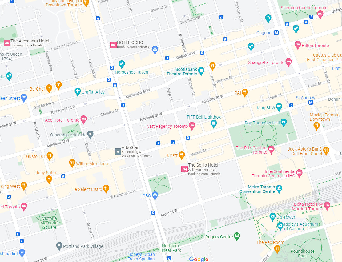
It’s a subtle but important accessible design choice that we see every day.
Example 4
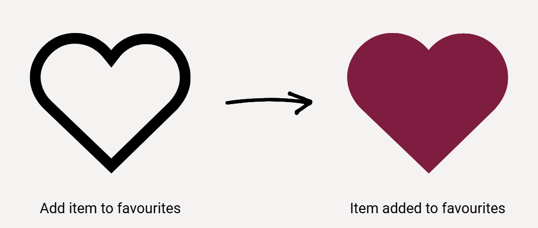
While online shopping, you add an item to your wishlist by clicking a heart icon. By making the icon go from a black outline of a heart to a solid red heart, both the color and the shape (from outline to solid) has changed.
Exceptions
Technically, it is acceptable for lightness to be an acceptable indicator beyond color. For example, changing the outline of an input field in error from black to red with no other changes (assuming the black and red have a 3:1 colour contrast between them). But this change can be difficult to notice, so it’s better to make an additional change like a thicker outline or add an icon.
Practical guidance
You should continue to use beautiful, colorful designs in your work! Color is useful for many people to understand information and makes your content more accessible.
The goal isn’t to detract from your interface, it’s to ensure that colour is not the only way information is conveyed. That means asking a simple question during design and build:
If someone can’t see this colour difference, how do they still know what is being communicated?
In practice, this often means adding one additional layer of communication, such as:
Underlines or outlines
Icons paired with colours
Text labels
Font or line weight changes
This additional layer doesn’t create noise. It adds clarity for everyone. Plus, it makes your design more robust - across different lighting conditions, varying quality displays, high-stress situations (like form errors), a user can more easily and quickly interpret a design.
Accessible colour isn’t about limiting creativity. It’s about designing interfaces that remain understandable when conditions aren’t perfect.
And that’s simply good product design.
Aleph Accessibility helps organisations make clearer, more confident accessibility decisions across design, delivery and procurement.
If you want to make accessibility part of the way you work, you can learn more about our audits, consulting and training, or get in touch for a short, no-obligation conversation.